Sunday 23 February 2014

Scene 4. Segue Scene and Lava Basement

Now we start to descend into a slightly scarier setting, ironically this is via a downward spiral, this provides a small physical thrill;

There are a few lion graphics on the wall, but no real 3-dimensional theming elements - This is because the wall and ceiling are just about within touchable distance for the adult rider. If people want to try and stand up during this, that is up to them. We’ve already made the ceiling unnecessarily smooth for these people incase they do. This slight closeness is part of the selling point. I think you definitely lose something if you have to make everything big and far away in a dark ride. 


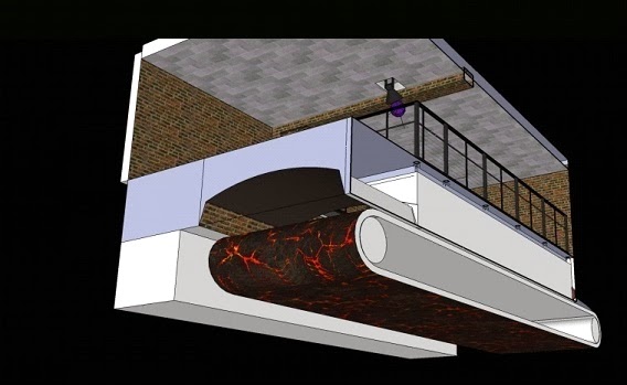
After the spiral we arrive at the 'Lava Basement'. Please forgive the lack of track here; This does not mean this you get out of the car here to be picked up later (although that could be a good idea for later on), it’s just I thought this was going to be a walk-through part when I first made it.
The main Effect here is the Lava Conveyor belt - made from latex. If this effect can be proven it could be pretty cool. The below/next image takes us below floor level to show how it works;


The latex belt is made in a large flat mould and then the detail is painted on using UV reactive latex paint for the lava parts.

Smoke can be used to make it look hot. It would cling to the belt as it rolls forward from the tunnel


(above/previous: Showing the back of the scene)


Significant theming/effects


Leaving this scene through the arched doorway on the right we find ourselves in a strange corridor;


The mortars a pulsing red and blue light before we reach the end where the structure of the hole corridor twists before "exploding";


Matrix inspired Code rains down on two big back projection screen which sandwich the track. This should create an odd, rising feeling.


Scene 3. "Crazy Time Dimension"/Castle Ruins

The main theme in this scene is time/time being different.


A huge, curved back projected screen plays an image an ever changing, time-lapsed sky;


The clocks you see are going haywire as part of the expression of time being different.

Significant theming/effects list

-The whole set is on a tilt (this is an old effect, but is CLASSIC so can be used time and again)
-Fog that blows across the front of the curved screen as a 4D effect 
-Quote on the front of the set about time
-Haywire clocks
-Glowing stained glass windows

Psychological Significance Of Darkness

Between the portal tunnel and the start of the Castle Ruins is our first block of significant darkness. It’s kind of powerful because in sufficient darkness, all of your black painted breeze blocks, girders and the walls of the warehouse go from being domestically recognizable to being one and the same, uncertain and unending blackness. Ride designers usually put a block of darkness at the start of a dark ride so that people’s eyes get used to darkness but I believe it also has an effect on our minds. Fear of darkness is the fear of not knowing; This fear, along with the slightly lowered state of consciousness caused by darkness makes people more suggestible and imaginative –and of course this is a great thing in context of a dark ride(!). One other thing it does is to conceal the imperfect (sometimes even laughable!) condition of props or other parts of the set.

Psychological Significance Of Doorways /Archways

Sometimes when you walk through a doorway and into a room you completely forget why you went there in the first place. This is because walking through a door is used by the brain as an “event boundary” to categorize things that happen. We can remember things better/ generally compute things better when we make associations for things.  Professor Gabriel Radvansky is the one who figure this out, this is what he said:
"Entering or exiting through a doorway serves as an 'event boundary' in the mind, which separates episodes of activity and files them away," Radvansky explains.

"Recalling the decision or activity that was made in a different room is difficult because it has been compartmentalized."
So this is why my ride and many existing dark rides have a lot of arch/doorways. It’s about information. You could call this “framing” and basically it helps people’s brains to break down and digest a different setting.


Saturday 22 February 2014

Scene 2. Portal Lab


"Ahh, thank goodness for that," the guest thinks to himself. "I thought I'd walked onto the worst ghost train I'd ever seen".
 As you can see, the theming here is a bit more imaginative. The picture describes most of the ins and outs of the scene except for one thing; an invisibility illusion;


 Depending on the max size of mirrors available and the vibrations of them due to being in close proximity to a moving ride vehicle, this could be an awesome illusion. As you can hopefully see by the labelling of the mirror edges, it uses 2 large mirrors at 45 degree angles (these conceal a diamond shape tunnel). The biggest mirrors I have seen were in use in an illusion created by an artist called Leandro Erlich. If you search Google for “house mirror illusion” you can see his work and the mirrors he used.
 The wall, ceiling and floor must look the same for this to work.


As the car passes through the worm hole generator we pass through a laser screen. The laser effect unit is in the bottom so that the car cuts through the beam shielding the ride from it. The outside ring it says “particle collider” as a reference to modern science, namely the Large Hadron Collider.


Inside the diamond shaped tunnel concealed by the mirrors. The bend depicted here also seems feasible.
At the end of this tunnel there is bright strobing to create a general disorientation. This strobing must happen against pitch darkness or the effect is not as good.

Significant Theming/Effects
-The track being bendy/dynamic
-Beacon lights
-Warning signs

Note about dark coasters/“psycoasters”

While the track is quite dynamic, this is not a hybrid/dark ride-coaster. For those who do wish to build or just imagine one for any reason;-  your ride car/train must go SLOWELY through the dark parts/scenes. It’s well proven now, that when a coaster goes through a scene at 50 mph, the human mind can’t really register what’s going on. People are able to just about see what’s going on, but they generally don’t have anything to write home about because it all happened too fast.

Scene 1. Art class

Upon exiting the station, we turn a corner; - ride designers like to do this because it conceals the first scene from people in the station.
 I thought it would be kind of funny if the first scene looked a bit rubbish so I decided it could be an art classroom since we are in a university.


A papier-mâché bear leans towards riders as they pass, lit by an old desk lamp. An old tape recorder plays bear sounds.

Signs point the way to a "portal lab" where hopefully the theming is a little better!!
It’s important that this scene is made in the exact same way as a real classroom rather than using fibreglass and other theming materials/techniques.

Significant effects/theming list
-Papier-mâché figures
-Old tape recorder and desk lamp
-Building it from the same unexciting materials and in the same way as a real classroom
-The whole scene being around a corner/hard bend so that the people in the station can't see it

The Ride Station

Firstly, I'm going to tell a short story of acumen before we enter into the ride station itself;
 A little while back now, there was a ride called "The Fifth Dimension" at a park called Chessington World Of Adventures in Surrey, UK. I was 5 or 6 when I rode it and it still is one of my favourite experiences I've had in life. Anyone who went on it knows it was a great ride and crowds –men, women and children would even burst into spontaneous applause as the ride-train returned to the station...But 5D had a problem. It just wasn't racking up the numbers and one of the main reasons for this was that the outside theming really didn’t give much away about the ride inside (it actually appeared much like it did on old maps). It seems like a cool idea at first but from a marketing point of view, you are always going to get more footfall if you yell about the good points of your ride in the preface of it.
So now we know that the ride building has to describe the ride and we should use signs that are big, bright and fun and describe the ride somewhat.
Into the ride station;


Above/previous is the inside of the ride station I've come up with, as it stands at the moment. It doesn't have signs due to the fact I didn't have a name when I was rendering it but it should have a sign for the sake of framing and so people are fully aware they are actually going on a ride. I think one above the archways will look good. It is supposed to be part of a well invested university but funnily enough, also be kind of themeless due to the amount of different themes in the ride. The outside of the building won't be themeless, however!!


As the above/previous image shows, the station looks a little bit like part of a shopping centre or multiplex cinema and though it does have a certain commercial, "feel good factor" to it,  it may not be the most interesting thing for young kids.

Significant effects/theming list
-‘Wiffle Ball’ style, molecule sculpture
-Gallery that looks over “platform”
-Restricted access signs on archways (left on first image)

Introduction

Welcome to my blog of dark ride ideas. Here you will find many ideas which I have set out as one big dark ride. I hope you enjoy it.